Engineering article
Making FoodieCalc more accessible before launch
A personal look at the accessibility pass behind FoodieCalc, from VoiceOver summaries and widgets to Reduce Motion and the screenshots still worth testing before release.

Accessibility pass

FoodieCalc has reached the kind of stage where the question changes.
At the beginning, the question was: can I build the nutrition tracker I want to use?
Later, it became: can I make the architecture strong enough to grow?
Now, before launch, the question is more important: can more people actually use it well?
That is what the latest accessibility pass has been about. Not as a checkbox, not as a last-minute App Store chore, and not as something separate from design. Accessibility is product quality. If a screen looks beautiful but VoiceOver reads it as a pile of disconnected numbers, the product is not finished.
Why this mattered to me
FoodieCalc started from my own interest in nutrition and fitness. I wanted a quick native way to keep nutrition goals on track, and I wanted it to feel like an app I would actually enjoy opening every day.
But habits are fragile. Food logging already asks for attention. If the app becomes confusing, noisy, visually dependent, or hard to operate with assistive technologies, it creates friction exactly where the user needs support.
That made accessibility feel deeply connected to the original purpose of the app.
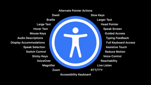
The goal was not only “add labels.” The goal was to make the app communicate clearly through more than one channel:
- visually, through layout and hierarchy,
- semantically, through VoiceOver,
- calmly, through Reduce Motion alternatives,
- compactly, through widgets,
- and reliably, through native controls that keep system behaviors intact.

Seeing the work in the app
Accessibility work can sound abstract until it is visible in the actual product.
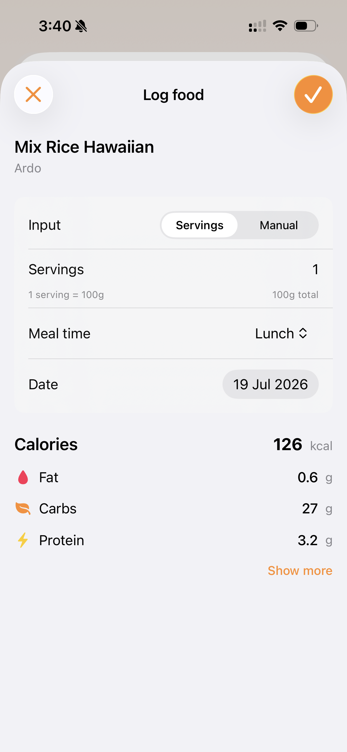
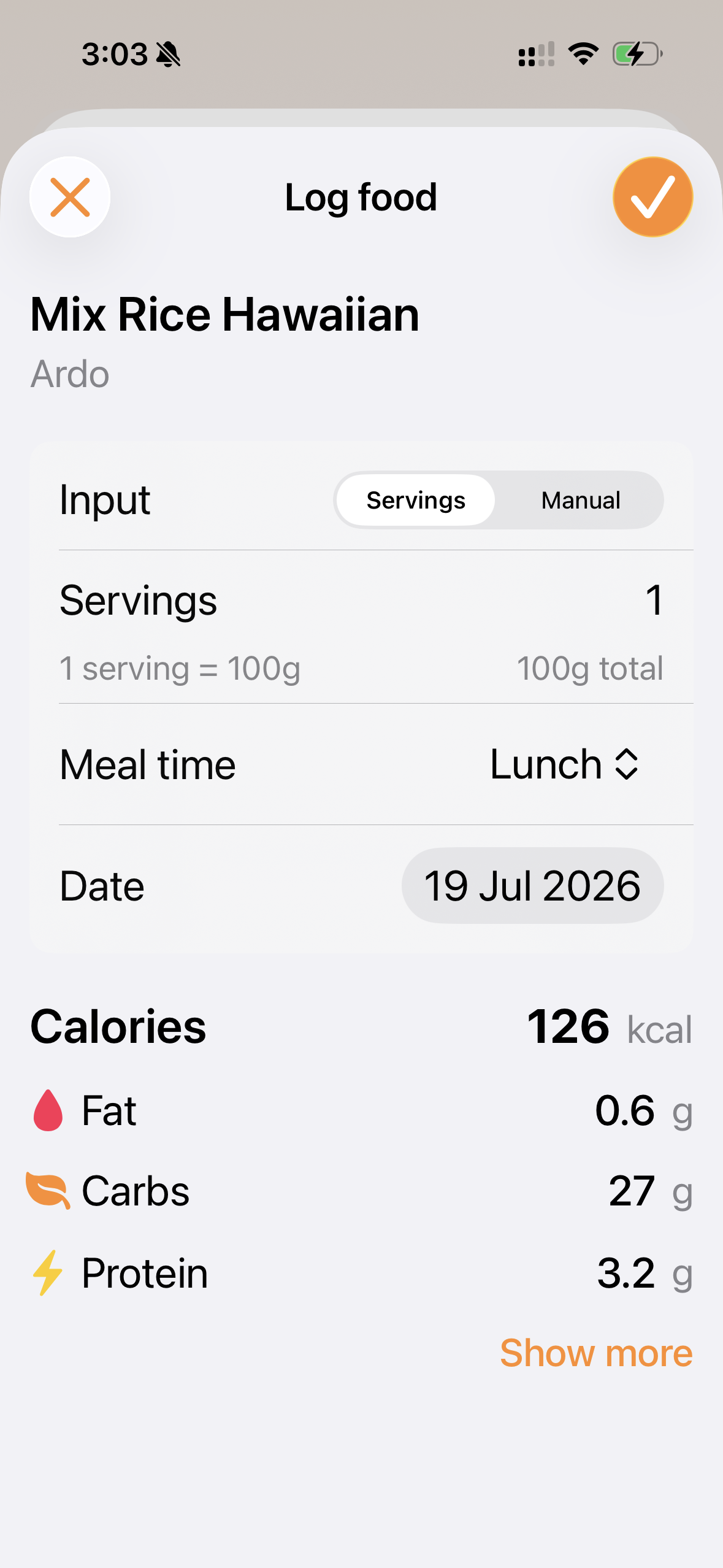
These screenshots show the kind of QA I care about before launch: the same FoodieCalc surfaces under different text sizes, different themes, and real app states. The goal is not only that the screens look good. The goal is that the structure survives when the system settings change.
The dashboard needed meaning, not just rings
The dashboard has calorie and macro cards with circular progress rings. Visually, those rings are useful. You can glance at calories, protein, carbs, and fat and understand the day.
But a progress ring is not automatically meaningful to VoiceOver.
Before the pass, the risk was that VoiceOver could walk through decorative pieces: numbers, slashes, labels, icons, circles. That is not how a person thinks about nutrition progress.
The better version is one coherent element:
.accessibilityElement(children: .ignore)
.accessibilityLabel("Calories eaten")
.accessibilityValue("820 of 2,200, 37 percent of goal")
The same idea now applies to each macro card:
.accessibilityLabel("Protein eaten")
.accessibilityValue("74 of 160 grams, 46 percent of goal")
That is the difference between exposing UI parts and explaining state.
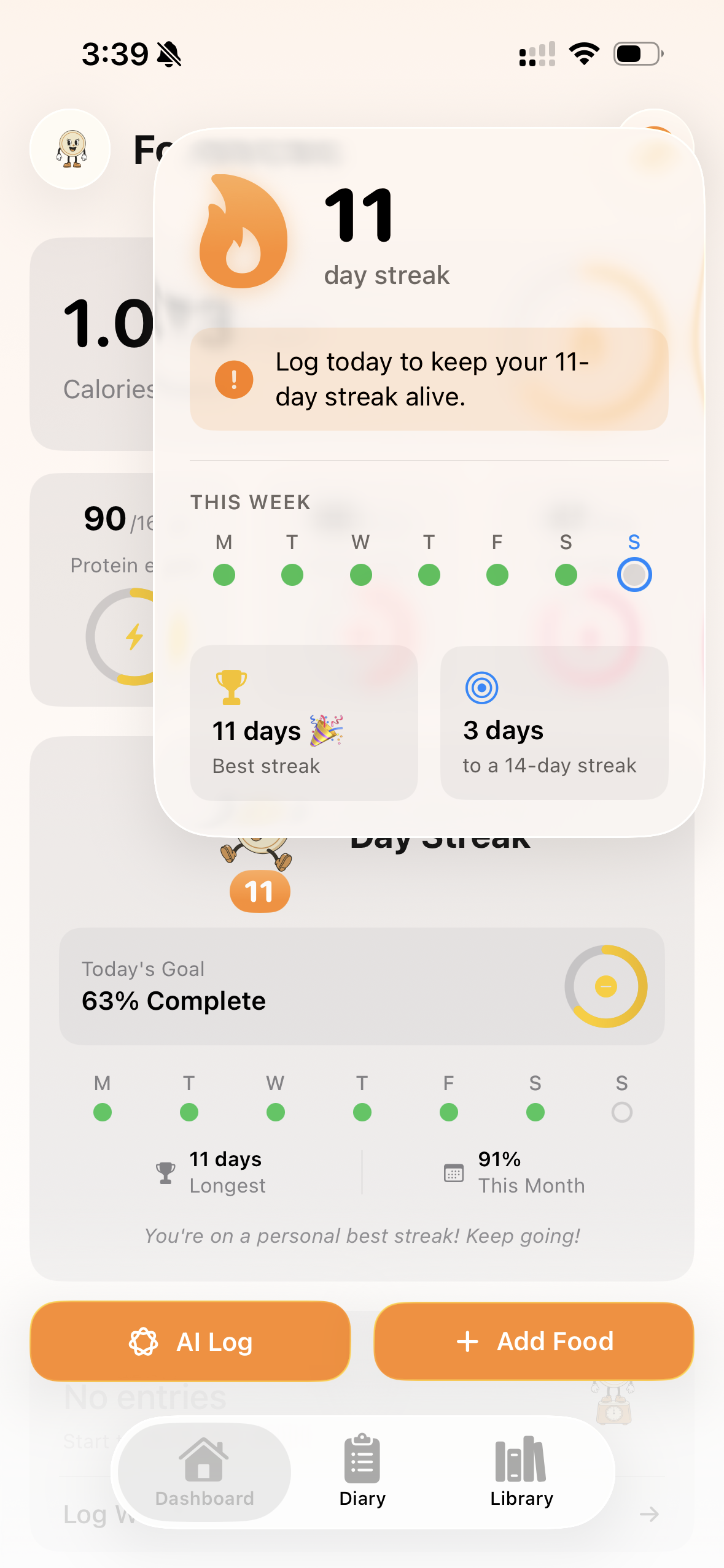
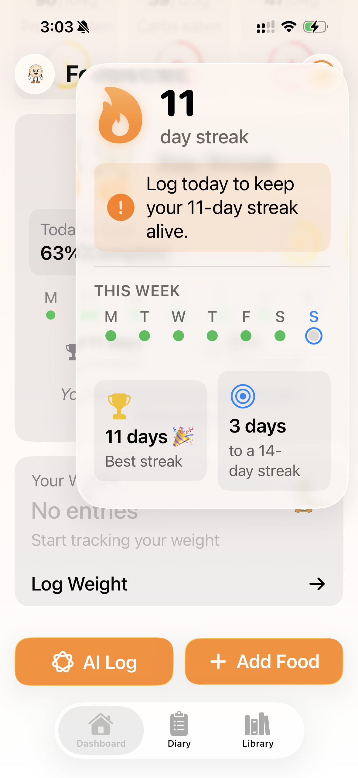
The streak overlay is another good example. It is visual and celebratory, but it also contains status that needs to remain understandable: current streak, weekly progress, best streak, and distance to the next streak target.
The diary week pager had a hidden color problem
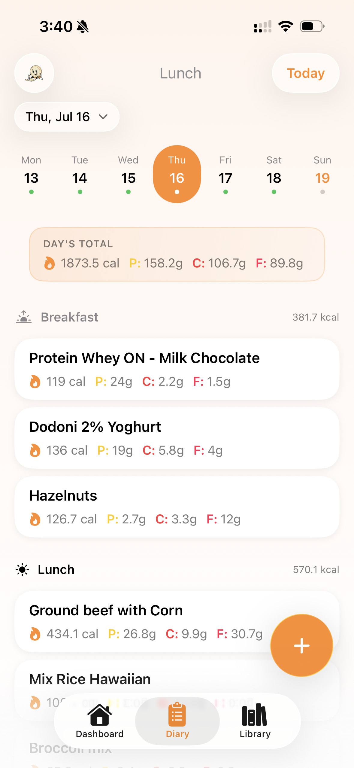
The diary week strip is a small part of the interface, but it carries a lot of meaning.
Each day can show a completion state. Visually, a dot can communicate:
- goal met,
- cheat day,
- food logged,
- no entries,
- selected day.
That is efficient for sighted users, but color-only state is fragile. VoiceOver needed the same information in words.
FoodieCalc now gives each day button a locale-aware label and a spoken value:
.accessibilityLabel("Today, Monday 15 March")
.accessibilityValue("Goal met")
.accessibilityAddTraits(.isSelected)
There was a small engineering detail here that I liked. The day button stayed a real Button. I avoided wrapping it in a way that would break the selected capsule animation. Accessibility and interaction polish should not have to fight each other.
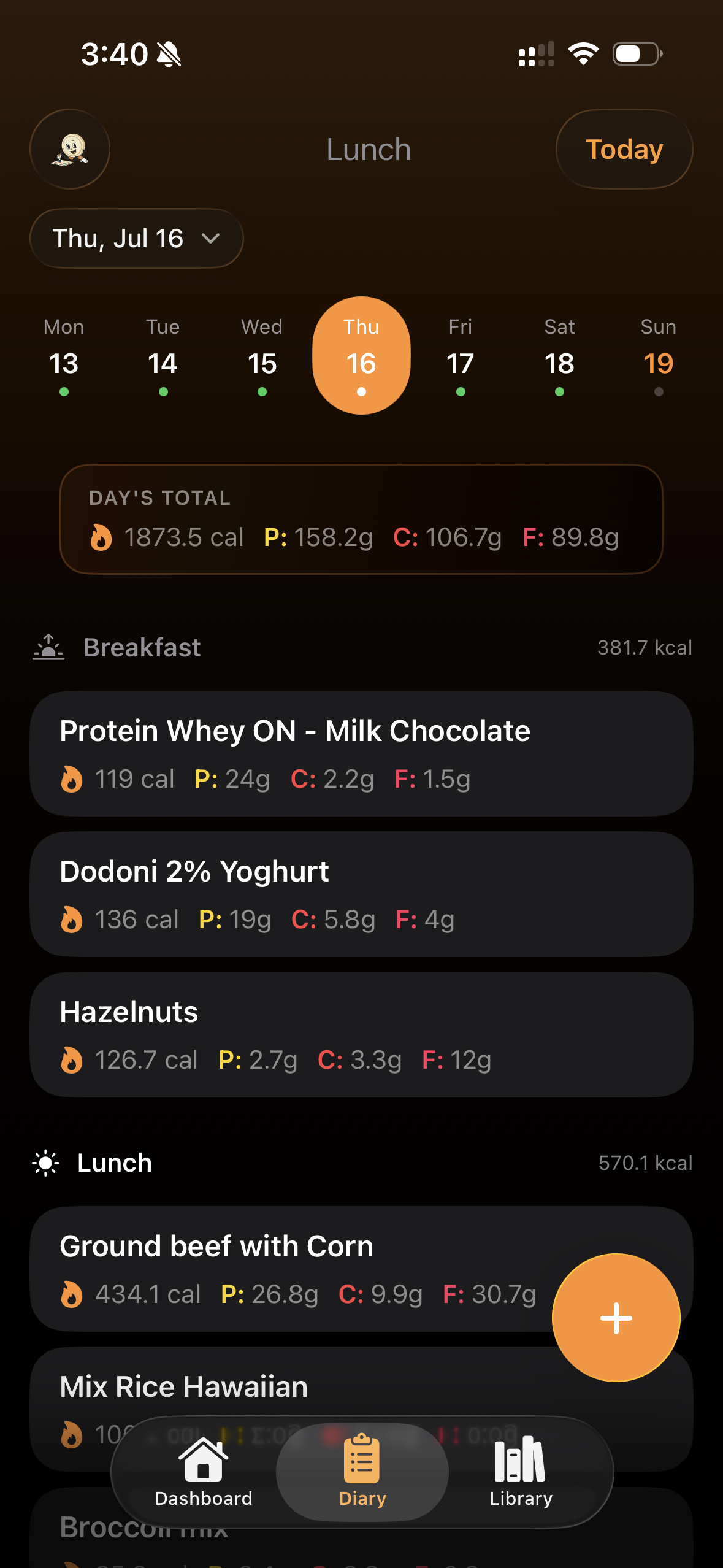
The Diary also became a good place to check light and dark mode. The same completion dots, macro abbreviations, selected day state, and bottom navigation need to remain clear in both appearances.
Widgets needed their own accessibility pass
Widgets are easy to treat as tiny screenshots of the app.
They are not.
FoodieCalc widgets had their own accessibility work because they compress important state into very small surfaces: calorie progress, macros, streaks, quick log actions, and Lock Screen summaries.
The six widget families now have more coherent spoken summaries:
Calories and macros are grouped into one meaningful summary instead of fragmented visual parts.
Streak, week-day dots, and calorie snapshot state are spoken together so color dots are not the only source of meaning.
The calorie ring speaks as a goal percentage, and compact macro labels expand from P/C/F into full nutrient names.
Widget actions now say what they do: log with AI, add food manually, and open the right FoodieCalc flow.
There were also truncation guards for hero numbers with lineLimit(1) and minimumScaleFactor(0.7). That is not glamorous, but it matters. A widget that clips the most important number has failed at being glanceable.
Barcode results: no more single-letter nutrition
FoodieCalc uses barcode scanning for packaged foods. In the UI, compact macro pills can say P, C, F, and Cal because space is limited.
VoiceOver should not have to guess.
The barcode result screen now speaks the full names:
- Protein
- Carbs
- Fat
- Calories
That is a small change with a big difference. Compact UI can stay compact visually while becoming explicit semantically.
Motion had to respect the user
FoodieCalc has a lot of movement: date changes, chart updates, dashboard changes, milestone celebrations, selected capsules, and small transitions that make the app feel alive.
But motion is not universally pleasant. For some users, it can be tiring, distracting, or physically uncomfortable.
That is why the design system includes a shared motion helper:
public static func transition(
    edge: Edge = .bottom,
    reduceMotion: Bool
) -> AnyTransition {
    reduceMotion
        ? .opacity
        : .move(edge: edge).combined(with: .opacity)
}
Milestone celebrations also read accessibilityReduceMotion. When Reduce Motion is enabled, FoodieCalc avoids the more animated path and gives a calmer equivalent experience.
That phrase, “equivalent experience,” is important. Reduce Motion should not mean “no care.” It should mean the same product intent, delivered in a calmer way.
What still needs real-device QA
The code pass is meaningful, but accessibility is not finished from code alone.
The screenshots above are a strong start for Dynamic Type and theme review, especially around the Log Food sheet, Diary rows, and streak overlay. Some values still use fixed-size rounded fonts because they are part of the visual identity of the app. That can be okay, but it needs proof on-device across more content combinations.
Contrast also deserves real testing across:
- light mode,
- dark mode,
- accent colors,
- Increase Contrast,
- Differentiate Without Color,
- Bold Text,
- Reduce Transparency.
This is where previews, real screenshots, and recordings matter. The code can express intent, but the product has to be seen, heard, and operated.
What I learned
The biggest lesson was that accessibility work made the app’s design clearer.
When I had to decide what VoiceOver should say, I had to decide what each surface really means. Is this ring decoration, or is it the calorie goal? Is this dot just a color, or is it a status? Is this icon-only button obvious, or does it need a real label? Is this animation helpful, or should it fade when the user asks for less motion?
Those questions improve the whole product.
They also made me respect SwiftUI more. A lot of the work was not about inventing custom infrastructure. It was about using the system well:
- real
Buttoncontrols, - accessibility labels and values,
- selected traits,
- environment values like
accessibilityReduceMotion, - widget summaries,
- and native layout behavior that keeps the app understandable.
VoiceOver: working, but still a journey
The screenshots show the visual side of the accessibility work. The recording below shows the more important part for VoiceOver: what the app says as someone moves through the interface.
This is not the finish line. VoiceOver quality is something I want to keep improving with real use, not only with my own testing. Any feedback is welcome, but feedback from users who actively use VoiceOver would be especially helpful: confusing labels, missing values, noisy focus order, repeated announcements, unclear actions, or places where the app should say less.
That feedback will help take FoodieCalc’s accessibility to the next level.
Accessibility is a journey, but this was a serious step. FoodieCalc is becoming not only more polished, but more understandable.
That is the kind of product I want to ship.